ZENPULSAR’s social media analytics platform, PUMP 2.0, can be used not only to support investment decisions but also to aid in designing narratives and market analyses produced by journalists, finance-focused social media influencers, and analysts. In this article, we are taking a look at some of the functions of PUMP 2.0 relevant to these segments of our users.
Being That Trusted Source
Analysing financial markets and assets isn’t the monopoly of investors and traders. Journalists, news publishing portals, market analysts and pundits, and finance-focused social media influencers are some of the parties whose success and livelihood depend on delivering trustworthy and robust market descriptions, narratives, forecasts, and opinion pieces.
These niches are also massively saturated, with thousands of individuals and businesses striving to deliver the most well-crafted market narratives and perspectives. Given the level of competition in these areas, the ability to be a source that consistently delivers great market insights, and does so faster than others, becomes paramount.
This is where PUMP 2.0 can provide immense utility and support to anyone crafting market insights and narratives for their users or followers. PUMP 2.0 acts as a comprehensive social analytics platform. Besides tracking quantified social media sentiment for financial assets, the platform includes other tools to support market reporting, analysis, and forecasts. These include a highly customisable news feed, a ChatGPT-style financial assistant, a map of major assets by prevailing social sentiment, and more.
How PUMP 2.0 Supports Market Narratives
Below, we outline some of the functions within PUMP 2.0 that can aid in designing market narratives, reports, insights, and forecasts:
1. PUMPChat
PUMPChat is a generative AI chat assistant that has been integrated into our platform starting with PUMP version 2.0. PUMChat has been extensively trained on finance-specific data and, therefore, is capable of providing more relevant financial narratives and descriptions than the popular ChatGPT from OpenAI.
PUMPChat also verifies its output against an extensive, up-to-date database of social media content. This makes PUMPChat suitable both for describing recent market events and for forecasting future development based on the prevalent social media sentiment. The image below shows an example of how PUMPChat makes a forecast with regard to an important development many in the crypto world eagerly await – the potential approval of Bitcoin spot ETFs by the US Securities and Exchange Commission (SEC).
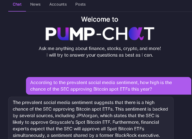
The output of PUMPChat above shows how the tool provides detailed insight on the question posed by the user. Note also how we posed the question to be based specifically on the current “prevalent social media sentiment”. This requires the tool to source its answer from the actual discussions on social media instead of simply generating a naturally-sounding output. PUMPChat’s ability to verify its output against a factual and up-to-date database makes such querying possible.
2. Customised AI News Feed
The news feed in PUMP 2.0 provides insights and key news sourced from a wide variety of social media and publishing sources. The feed is highly customisable, allowing you to get the most relevant news and articles based on sectors, sub-sectors, or specific assets of interest to you. The feed’s contents are adjusted using AI algorithms to deliver the news that fit each user’s overall activity patterns on PUMP 2.0.
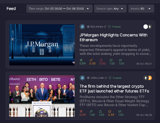
You can also filter the feed by Trusted vs Non-Trusted sources, further improving the quality of the content you see.
The news feed is a critical gateway to quickly learning of the key developments related to financial sectors and assets. For many journalists and social media influencers, the ability to quickly share topical news can enhance their online presence and help cement their reputation as a reliable and proactive source of information.
3. Sentiment Colour Map
If you need to analyse and report on the prevailing sentiment towards specific markets – e.g., crypto, stocks, commodities – rather than individual assets, the coloured sentiment map provides a great visual aid.
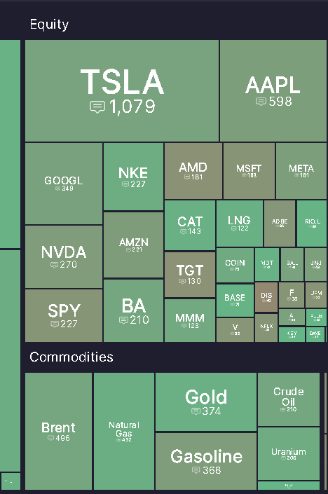
Assets with bullish sentiment are coloured in bright green. As an asset’s sentiment moves towards more bearish, its colour changes to darker green, then brown, and then red for the most bearish assets. The image above shows social sentiment for major equities and separately for some key commodities.
When the entire market segment takes on one colour uniformly, we are dealing with an overall market-wide bullish or bearish sentiment. However, more often than not, the colours for specific assets within each market segment are different to some degree.
Using this map lets you quickly identify the most bearish and bullish assets within each market. These are often assets that have important market events, controversies, crashes, or surges associated with them – i.e., they typically represent the juiciest bits of market intelligence to share with your subscribers or followers.
4. Asset-Specific Sentiment Charts
Focusing on individual financial assets that capture headlines during a particular topical moment for the market is the bread and butter for financial journalists, analysts, and influencers. The market’s biggest gainers and losers, cryptos implicated in pump-and-dump schemes, assets whose quarterly earnings deliver jaw-dropping surprises – all these become critical to cover and report on.
This is where the asset-specific sentiment charts in PUMP 2.0 can help with crafting effective narratives. PUMP 2.0 provides a number of sentiment measures that are tracked and plotted using line charts. In total, more than 16,000 assets – cryptocurrencies, equities, commodities, forex pairs, fixed-income assets, and alternative assets - are covered.
The asset-specific measures include the standard bullish and bearish sentiments, as well as derived measures such as dominating sentiment and scaled dominating sentiment. The dominating sentiment measure indicates the current prevalent sentiment (bullish or bearish) for an asset. These sentiment measures are available as line charts in PUMP 2.0, and for many assets, the time series data stretches back 5 years.
The image below shows the dominating sentiment chart for the Toncoin (TON) cryptocurrency. The green-coloured areas are the periods when TON’s overall social sentiment was bullish, while the red-coloured areas indicate the periods when TON’s sentiment turned bearish.
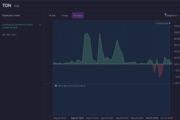
Using asset-specific sentiment charts, you can provide analysis and narratives on an asset’s past or very recent performance. You can also forecast future developments for an asset using some of the measures that we have found to have strong predictive power; these are typically the set of the derived dominating sentiment metrics.
The four tools and functions within PUMP 2.0 described above form the backbone of using the platform for gaining insights and crafting data-supported market narratives. As a user gains more experience using the platform, they are likely to develop additional, personalised ways of sourcing relevant information. PUMP 2.0, being a comprehensive finance-focused social analytics platform, provides a myriad of ways to help you be that leading source of market insights for your subscribers and followers.